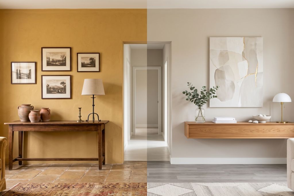
You walk into your living room… and suddenly you’re in 2004.
The furniture has changed. The décor has evolved. You finally upgraded the lighting. Yet something still feels off. Then it hits you.
It’s the walls.
Paint has an incredible ability to shape the personality of a room. The right color can make a home feel brighter, calmer, and more current. The wrong one? It can quietly convince your brain that flip phones are still a thing.
The good news is that bringing your home back into the present doesn’t usually require a major renovation. A fresh, thoughtfully chosen color palette can completely shift the atmosphere. Homeowners throughout Powell, Dublin, Worthington, and Lewis Center are discovering that sometimes the biggest transformation comes from the simplest change.
So…is your home secretly living in another decade? Let’s investigate.
Heavy Tuscan Gold → Soft Warm Greige
Remember when every wall looked like it belonged inside an Italian villa? Golden beige and deep Tuscan tones had a long run, but they can now make rooms feel darker and more enclosed.
Today’s designers often lean toward warm greige shades with subtle beige undertones. They still feel welcoming, but they also reflect more light and pair beautifully with both traditional and contemporary furnishings.
Cool Gray Everywhere → Warm, Layered Neutrals
For years, cool gray was the color everyone seemed to choose.
Then something happened. Homes started feeling…a little chilly.
Instead of stark gray, many designers now recommend warmer neutrals that add depth without making a room feel cold. Soft mushroom tones, warm taupes, and creamy off-whites create spaces that feel relaxed and timeless. They’re especially popular in homes around Liberty Township and newer neighborhoods throughout Powell, where natural light plays a big role in how color comes to life.
Bright White Walls → Soft Whites with Character
Bright white certainly looks clean. Sometimes it also feels a bit like walking into a doctor’s office.
Modern interiors still embrace white, but today’s favorites have warmer undertones that soften the space. The result feels fresh without looking sterile, allowing wood finishes, artwork, and furniture to become the stars of the room.
Deep Red Dining Rooms → Earthy, Nature-Inspired Colors
There was a time when rich burgundy dining rooms were everywhere.
Today, designers are embracing colors inspired by nature instead. Muted greens, warm clay tones, and soft earthy hues create inviting spaces that feel calm rather than formal.
It’s a subtle shift, but one that instantly updates a home’s personality.
Bold Accent Walls → Whole-Room Color
The single accent wall had its moment.
Now, many designers are moving toward rooms where color flows more naturally. Painting all four walls in a carefully selected shade often creates a more cohesive, balanced look than isolating one wall with a dramatic color.
It’s a great example of how simple changes can have a surprisingly big impact.
Ready to Bring Your Home Into the Present?
Trends will always evolve, but great color choices never feel like fads. The goal isn’t to chase every new palette. It’s to choose colors that complement your home, your lifestyle, and the way you want each room to feel.
That’s exactly where Color World Columbus comes in. We help homeowners across Powell, Dublin, Worthington, Lewis Center, and surrounding Central Ohio communities find colors that feel fresh today and continue looking beautiful for years to come. With expert guidance and professional craftsmanship, we take the guesswork out of updating your home.
After all, your walls shouldn’t be the only thing still hanging on to 2004. Your old ringtone can keep it company instead.
Leave a Reply