Tag: Color World Columbus

  • Paint Fails: 7 Exterior Colors Homeowners Wish They Never Picked

    Paint Fails: 7 Exterior Colors Homeowners Wish They Never Picked

    You know the feeling.
    You grab paint swatches. You hold them against your house at twelve different angles. Suddenly you’re saying things like, “What if we do a moody charcoal?” and “I think this soft beige has depth.” You’re excited. You’re inspired. You’re one online mood board away from becoming an exterior design expert.

    Then the paint goes up.
    And somehow your house now looks like a haunted dentist office. Or a giant banana. Or a building that belongs in a forgotten strip mall from 1997.

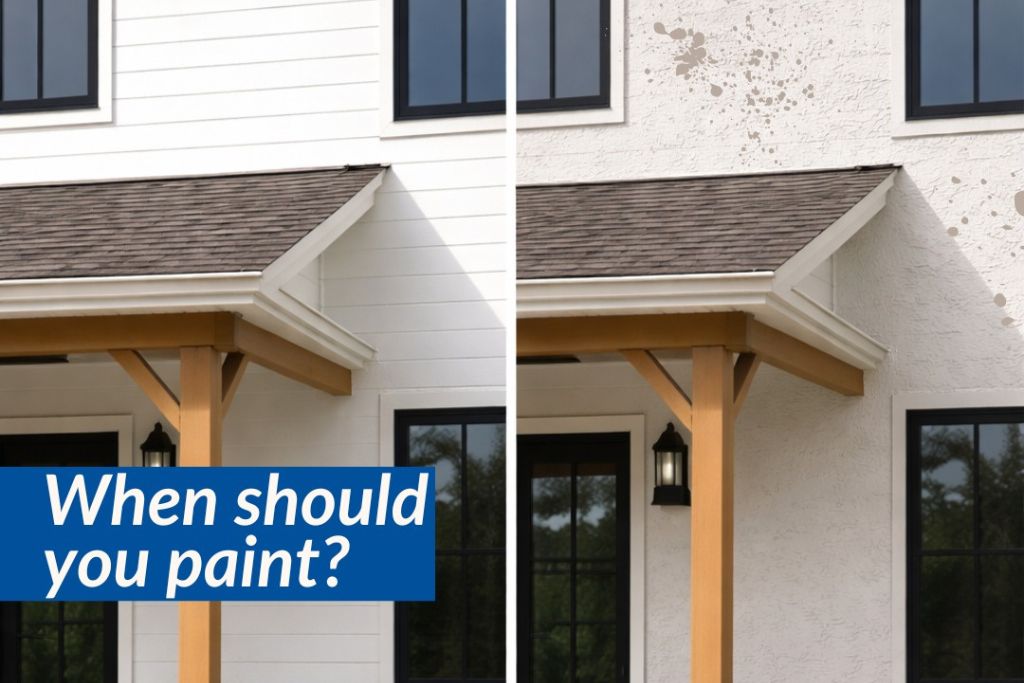
    Here’s the thing: exterior paint has a way of humbling people. Fast. And homeowners across Columbus know it can happen anywhere, whether you’re updating a historic home in German Village or giving a newer home in Dublin, Powell, or New Albany a fresh new look.

    Colors behave differently outdoors. Sunlight changes them. Landscaping changes them. Roof colors change them. Even your neighbor’s bright red front door can suddenly make your carefully chosen shade look completely different.

    And here in Central Ohio, the weather loves keeping things interesting. Bright summer sun, cloudy winter skies, changing seasons, and everything in between can completely shift the way a color looks once it lands on your exterior.

    Let’s dive into some of the most common exterior paint regrets homeowners run into.

    When Good Paint Ideas Go Very, Very Wrong

    1. Bright White Everywhere

    Expectation: Clean. Timeless. Magazine-worthy.
    Reality: My house is now a giant flashlight.

    White can look crisp and beautiful. However, ultra-bright whites often appear harsh outdoors. Direct sunlight can create glare and make a home feel flat or sterile.

    A softer white with warm or subtle undertones often creates a more balanced look.

    2. Beige That Accidentally Turns Yellow

    Expectation: Warm and inviting.
    Reality: Why does my house look like butter?

    Undertones can be sneaky. A neutral shade indoors may suddenly pull yellow, green, or peach outside.

    Exterior lighting reveals everything.

    3. Dark Gray That Goes Full Doom Mode

    Expectation: Modern sophistication.
    Reality: Haunted luxury bunker.

    Dark shades can look stunning. Yet when used without contrast or enough natural light, they can feel heavy and overpowering.

    Balance matters.

    4. Trendy Colors That Burn Bright…Then Burn Out

    Expectation: We’re making a statement.
    Reality: We’re making several statements.

    Exterior trends move quickly. That trendy color everyone loved online last year may feel dated much sooner than expected.

    Timeless usually ages better.

    5. Cool Gray Everything

    Expectation: Sleek and contemporary.
    Reality: Corporate office park energy.

    Many cooler grays became popular for years. However, some can feel cold and lifeless depending on surroundings.

    Homes should feel welcoming.

    6. Colors That Ignore Fixed Features

    Expectation: This color is gorgeous.
    Reality: Wait…why is it fighting the roof?

    Brick, stone, roofing, and landscaping are permanent players on your exterior team.

    Paint should work with them, not challenge them to a duel.

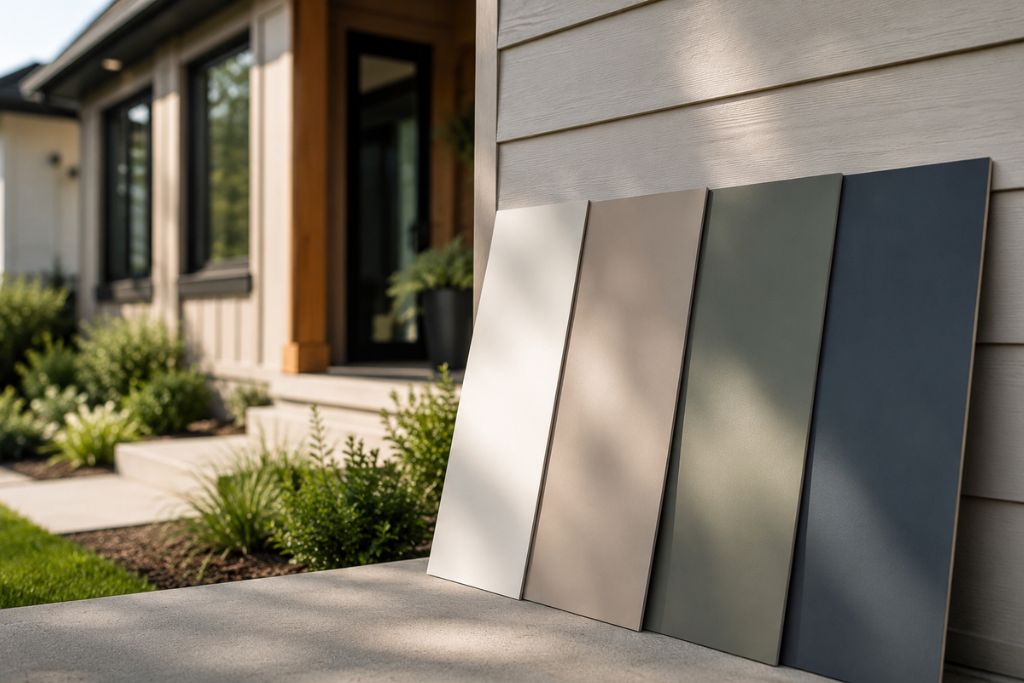
    7. Tiny Paint Sample Confidence

    Expectation: I tested it.
    Reality: I tested a square the size of a sticky note.

    Paint colors look dramatically different at scale. What works on a sample card may feel completely different across an entire house.

    This one gets people all the time.

    Great Exterior Color Choices Start Before the First Brush Stroke

    Picking an exterior color isn’t just choosing something pretty. It’s understanding undertones, lighting, architecture, surroundings, and how colors behave in the real world.

    That’s where experience changes everything.

    At Color World Columbus, we help homeowners avoid the “wait…why does this look weird?” moment. We help narrow choices, evaluate lighting conditions, and create combinations that feel cohesive and intentional.

    No one should finish a paint project and suddenly start avoiding eye contact with their own house.

    Avoiding a Paint Identity Crisis

    A fresh exterior should feel exciting. It should make you pull into the driveway and think, ‘Yep. That’s exactly what I wanted.’

    Not, ‘Interesting. Very…bold.’

    Paint should bring your vision to life. And sometimes, all it takes is having the right team help you get there.

  • How Long Exterior Paint Lasts in Columbus Weather (And What Affects It)

    How Long Exterior Paint Lasts in Columbus Weather (And What Affects It)

    A fresh coat of paint does more than improve your home’s look; it pulls everything together. It sharpens curb appeal, protects your exterior, and makes your space feel cared for. And while painting your home is always an exciting update, one question always follows: how long will it actually last in Columbus weather?

    The honest answer? It depends. Several factors influence how long exterior paint holds up, especially in a climate like ours.

    How Long Exterior Paint Typically Lasts in Columbus

    In general, exterior paint can last 5 to 10 years. However, in Columbus,Ohio, that range often leans toward the middle.

    Why? Our weather works overtime.

    • Hot, humid summers can cause paint to expand and soften
    • Cold winters and freeze-thaw cycles lead to cracking and peeling
    • Rain, snow, and moisture increase the risk of mildew and wear
    • UV exposure fades color over time

    All of this means your paint is constantly contracting, expanding, and weathering the elements.

    Key Factors That Affect Paint Lifespan

    Not all paint jobs age the same. Here’s what really makes the difference:

    1. Surface Material

    Wood siding typically needs repainting sooner (around 3 to 7 years), while brick or fiber cement can last longer.

    2. Paint Quality

    Higher-quality paints hold color better and resist cracking, peeling, and moisture damage.

    3. Prep Work

    Proper cleaning, sanding, and priming create a strong foundation. Skipping prep shortens lifespan, every time.

    4. Application

    Even coats and the right techniques matter. Professional application ensures better adhesion and durability.

    5. Sun Exposure

    Sides of your home that get direct sunlight will fade and wear faster than shaded areas.

    Signs It’s Time for a Repaint

    Not sure if your home is ready? Look for these quick indicators:

    • Fading or dull color
    • Peeling, cracking, or bubbling paint
    • Visible wood or surface underneath
    • Mold, mildew, or water stains
    • Chalky residue when you touch the surface

    If you’re noticing more than one of these, it’s likely time for a refresh.

    A Smarter Approach to Exterior Painting

    At Color World Columbus, we take the guesswork out of exterior painting. Our team evaluates your home’s current condition, considers Columbus-specific weather factors, and recommends the right timing and products for long-lasting results.

    We focus on proper prep, high-quality materials, and expert application, because a great paint job isn’t just about how it looks today but how it holds up years from now.

    Make Your Next Paint Job Last

    Exterior paint isn’t meant to last forever, especially in a climate like Columbus and surrounding areas like Dublin, Westerville, and Grove City. But with the right approach, you can maximize its lifespan and keep your home looking its best.

    And when it’s time for that next refresh, you’ll know exactly who to call.

  • Front Door Colors Columbus Loves (And What They Say About You)

    Front Door Colors Columbus Loves (And What They Say About You)

    Your front door does more than open and close. It sets the tone. It’s the first thing guests notice and the last detail they remember. In a city like Columbus, and throughout Ohio communities like Dublin, Westerville, and Grove City, where curb appeal matters year-round, your front door color quietly tells a story before you ever say a word.

    Choosing the right shade isn’t always easy. You want something that fits your home’s architecture, complements your exterior, and still feels like you. That’s where a little inspiration, and a bit of meaning, can help.

    The Most Popular Front Door Colors in Columbus (And What They Mean)

    Classic Black

    Timeless and sharp, black doors are a staple across Columbus, Ohio neighborhoods. They pair well with almost any exterior and instantly elevate a home’s look.

    What it says: You value sophistication, strength, and a no-fuss sense of style.

    Crisp White

    Clean, bright, and endlessly versatile, white doors feel fresh in every season. They work especially well on traditional or farmhouse-style homes.

    What it says: You appreciate simplicity, order, and a welcoming, open feel.

    Bold Red

    Red doors stand out, in the best way. They bring warmth and energy to a home, even on gray Midwest days.

    What it says: You’re confident, inviting, and not afraid to make a statement.

    Deep Blue (Navy & Slate)

    Blue continues to trend across Columbus, especially in deeper, moodier tones. It’s a modern choice that still feels grounded.

    What it says: You’re calm, dependable, and quietly stylish.

    Earthy Green

    From sage to forest green, these tones connect beautifully with nature. They’re especially popular in leafy neighborhoods and suburban settings.

    What it says: You’re balanced, grounded, and drawn to a sense of harmony.

    Warm Wood Tones

    Natural wood or wood-look finishes are making a strong comeback. They add texture and authenticity to a home’s exterior.

    What it says: You value craftsmanship, warmth, and a connection to tradition.

    Choosing the Right Color for You

    If you want a polished, timeless look, go black or navy.
    If your goal is warmth and personality, red or green might be your match.
    If you love a clean, airy feel, white is hard to beat.

    But here’s the truth: while trends and meanings are helpful, the best choice is always the one that feels right for your home and your style.

    How Color World Columbus, Ohio Can Help

    At Color World Columbus, we know that the “perfect color” isn’t one-size-fits-all. It’s all about balance: between your home’s character, your neighborhood, and your personal taste. Our team helps you narrow down options, test finishes, and land on a color that feels just right.

    Your front door is a small detail with a big impact. Whether you go bold or keep it classic, it’s an opportunity to express your style before anyone even steps inside. And when you’re ready to refresh it, we’re here to help you make it count.

  • Color, Reimagined: 2026’s Top Paint Trends for Columbus Homes & Businesses

    Color, Reimagined: 2026’s Top Paint Trends for Columbus Homes & Businesses

    A fresh year invites a fresh perspective, and in 2026, color is doing more than updating walls. It’s shaping how spaces feel, function, and flow. Whether you’re refining your home or rethinking your business, paint remains one of the most effective ways to bring a space into the present.

    Here in Columbus, where classic architecture meets modern living, the right palette can completely shift the energy of a space. This year’s trends lean warm, grounded, and expressive, a move away from stark minimalism toward something more layered, lived-in, and intentional.

    Here’s what’s defining 2026 and how to make it work for you.

    For the Home: Warm, Personal, and Effortlessly Layered

    Mushroom & Warm Neutrals (Taupe, Sand, Soft Khaki)

    Cool grays are stepping aside for warmer, more nuanced neutrals. Mushroom tones and soft khakis feel elevated yet approachable, adapting beautifully to changing light throughout the day.

    Choose this if: You want a timeless foundation that feels current, not cold.

    Earth-Driven Tones (Terracotta, Clay, Soft Brown)

    Grounded and quietly bold, these hues bring depth without overwhelming a space. They work especially well in living areas and dining rooms where warmth matters most.

    Choose this if: You want a cozy, curated feel that still reads refined.

    Muted Greens (Sage, Olive, Eucalyptus)

    Green continues to lead, but in softer, more natural variations. These tones create a sense of calm while subtly connecting interiors to the outdoors.

    Choose this if: You want balance, ease, and a color that never feels forced.

    Soft, Complex Blues (Dusty Blue, Slate, Ink-Washed Navy)

    Blues are becoming more layered and less predictable. Think softened pigments with a hint of gray or green, sophisticated and easy to live with.

    Choose this if: You want serenity with depth.

    Buttery Yellows & Gentle Pastels

    A quiet standout for 2026. Soft yellow, muted lavender, and barely-there green-blue tones bring lightness without feeling overly sweet.

    Choose this if: You want to brighten a space in a way that still feels elevated.

    Moody Accents (Plum, Burgundy, Chocolate Brown)

    Deeper tones are having a moment: used intentionally on accent walls, cabinetry, or smaller spaces. They add richness and a sense of quiet luxury.

    Choose this if: You want contrast, depth, and a more editorial finish.

    For the Office: Refined, Focused, and Forward

    Warm Whites & Creamy Off-Whites

    Still essential, but softer. These tones create a clean, welcoming environment without feeling stark or clinical.

    Choose this if: You want brightness that feels inviting, not rigid.

    Greige & Mushroom Neutrals

    Versatile and polished, these shades work across a variety of lighting conditions, ideal for open offices and shared spaces.

    Choose this if: You want cohesion and flexibility with a modern edge.

    Deep, Grounded Blues (Navy, Ink, Charcoal-Blue)

    These hues bring a sense of focus and confidence, making them perfect for conference rooms or feature walls.

    Choose this if: You want a space that feels strong, calm, and intentional.

    Soft Greens (Sage, Muted Olive)

    Subtle, but effective. These tones support productivity while creating a more relaxed atmosphere, especially in high-traffic workspaces.

    Choose this if: You want balance and a quieter kind of energy.

    Earthy Browns & Clay Tones

    A newer shift in office design. These colors add warmth and personality while maintaining a professional feel when used thoughtfully.

    Choose this if: You want to move beyond traditional office palettes without losing polish.

    Where Color Meets Craft

    Trends are a starting point, yes but execution is everything. The right finish, the right prep, and the right application make all the difference between a color that simply exists and one that truly elevates a space.

    At Color World Columbus, we guide clients through that process with clarity and precision. More than just following trends we translate them into spaces that feel tailored, cohesive, and built to last.

    A Fresh Coat, Done Right

    In 2026, color is less about making a statement and more about creating an atmosphere. The best spaces don’t shout, they resonate.

    And sometimes, the most impactful change is also the simplest: a fresh coat, thoughtfully chosen, expertly applied, and designed to feel just right.